

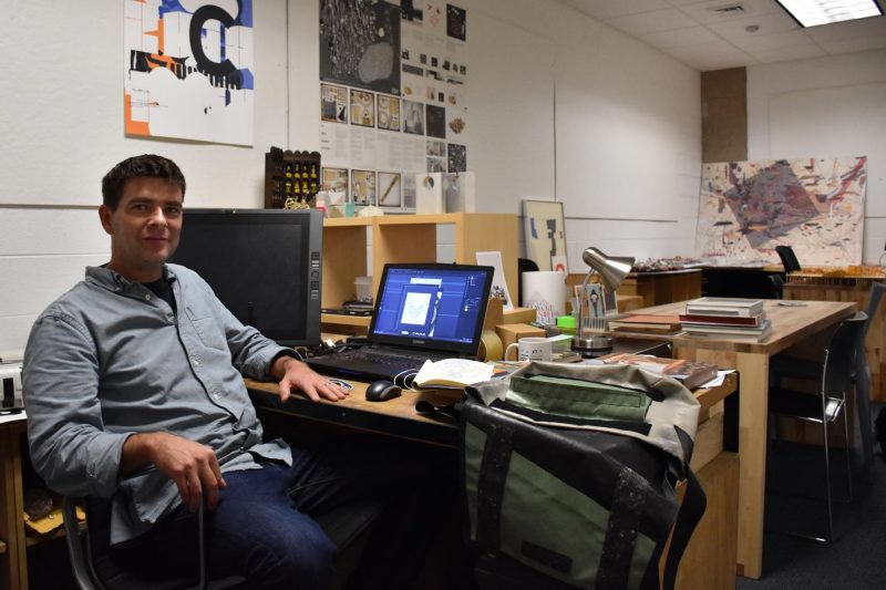
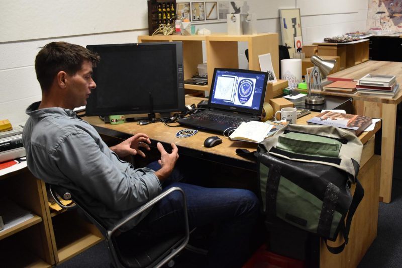
Chris Pritchett & Meaghan Dee Team Up to Redesign Blacksburg PD Patch
October 29, 2018
How did you come to be involved with this project?
Heather Browning, who works with the town of Blacksburg, contacted me as she knew that I did graphic work. I knew her from being around town and had done projects with her in the past including music event posters. She wrote me mentioning that the existing designer on the project was being a bit timid with their design and she believed that I'd be more experimental in my approach. After she reached out, I immediately contacted Meaghan because I don't believe myself to be good with logos. I think that I tend to make things a little too busy at times, especially to be a logo. Meaghan is really clean with her design - much cleaner than I am. So I asked her to partner up with me and that's how we got to do this together.
What did the design process look like?
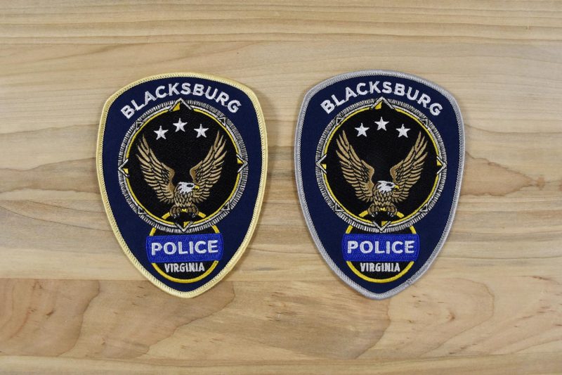
Meaghan and I had an initial meeting with the police chief and a few of the officers where we had the chance to talk about what they were looking for in the new patch and branding. We then met them again after two weeks and we each had four or five different directions for the design. They had a look at the different concepts and told us which ones they liked most as well as aspects from the others that they appreciated. We went away and combined the things they felt strongest towards into one main idea with three or four different variants on it, after which we let them pick again and then we finally settled on the final design.
What did you want out of the project when comparing it with the old logo?
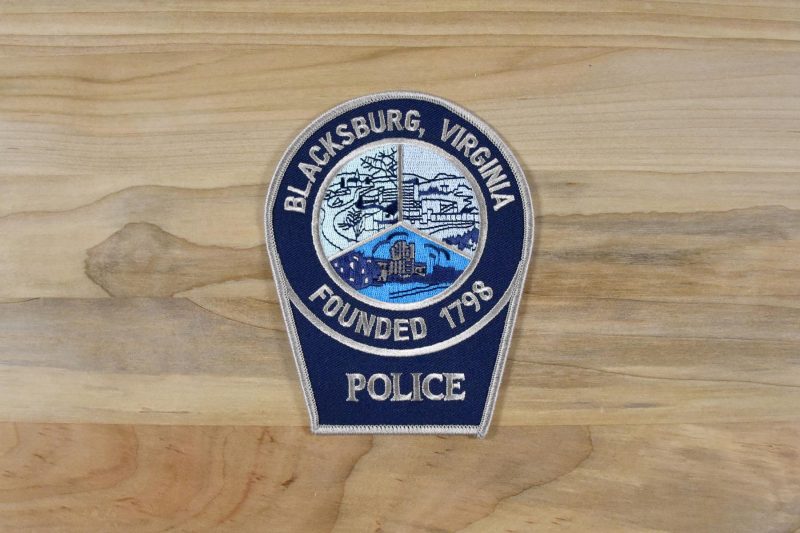
When looking at the old patch and logo, they actually admitted to us, they just weren't connected to it anymore. Some of the officers didn't know that there were three graphics on it or what those three graphics were. Another issue was that it had come to be a little out-dated and had started to look a little old fashioned. So we wanted to update it and create a design around a symbology that they could feel a connection to.
What inspirations did you have & make use of?
I looked at a lot of patches in general. I looked at every police patch I could find - the LAPD has some amazing graphics. I also looked at a lot of biker patches as well as Boy Scout patches for study as not only do they take things down to the simplest form but you have to keep in mind that they're also going to be stitched. Once a design becomes stitched like that, you're dealing with a certain line weight and so you have to be mindful of the amount of detail to include.
What were some of the challenges you encountered?
The Blacksburg Police motto is "Service, Integrity, Respect." What those things mean to us and what they mean to a police officer are completely different things. I have a little bit of a background being in the military and kind of understand where they're coming from but, the way they look at things like patriotism and loyalty, they look at those things differently than we do. We had to think on our approach as when we use a symbol that represents safety or america, we have to be mindful of that difference. I think we were successful with what we delievered in the end but it took a lot of conversation and consideration. The other thing was that I'm not great at logos, so Meaghan was absolutely crucial to the process of simplifying the complexity of what we were doing and cleaning it up.