

1st-Year Competition Winners
April 12, 2021
This year's first-year competition asked the foundation students to “create an intervention that changes (or alters) the use or meaning of …" the students were asked to “present the work in a triptych.”
The jury designated five winners: Will Barron, Jennifer Colebrook, Nylah Desnoyer, Gabrielle DeCotiis, Noah Freedman, and four honorable mentions: Malachi Mercado, Kristin Rice, Sam Hunter, Grayson Bennett. Congratulations to all the students! Below are their project descriptions:
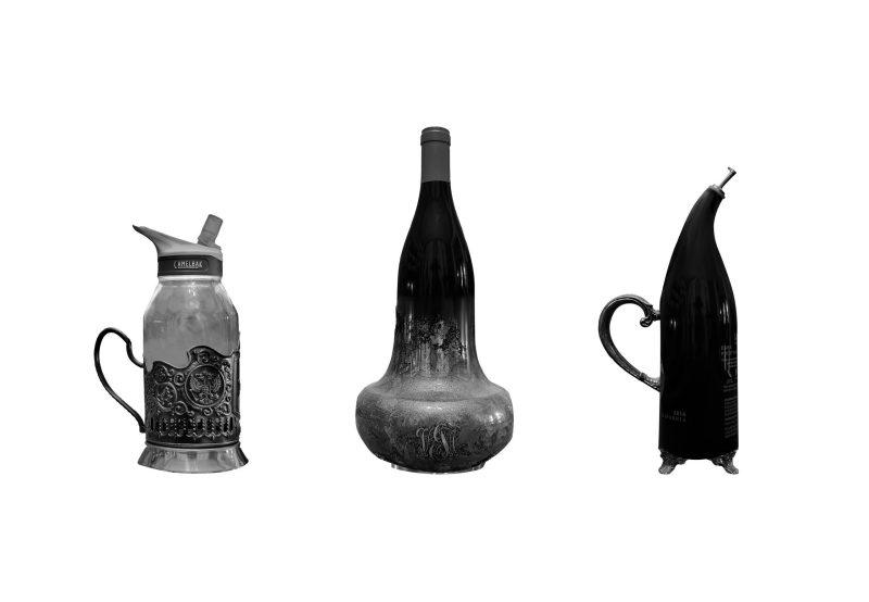
Will Barron
"As a remote student this semester, this year’s competition initially stumped me. Not only did I struggle with defining an intervention within the context of the prompt, but I had to come up with a way to create something but I am also working out of a closet at home. I knew I wanted my work to focus on a generic object and thus I eventually decided on bottles. I gathered a plastic water bottle, an antique teapot, an insulated metal mug, a mason jar, a wine bottle, an oil dispenser, and a podstakannik or Russian tea mug. From there I photographed each object individually and isolated it in Photoshop. From there, I digitally deconstructed each vessel into its main components and rearranged them until I had three unique objects. In doing so, I hoped to reveal that ordinary objects have the potential to be anything but only if you’re willing to suspend convention. Creating practical vessels was never the goal; if it were, I would’ve left the bottles alone. Instead, I want those who view my work to question my new vessels as well as those from which they were created. Challenging new ideas in addition to well-established ones is, in my opinion, the key to innovation."
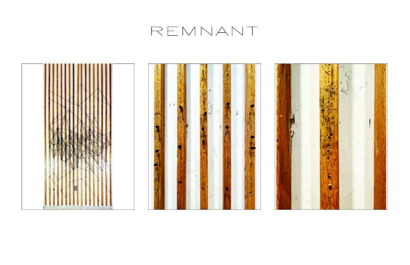
Jennifer Colebrook
"Cowgill Hall is lined with walls in which architecture + design students pin up their projects reflecting their ideas, designs, and proposals. I have been long inspired by the story told through the holes on the walls and from this is where my idea for intervention stemmed. Each hole, created by a push pin, represents a person through the blemish left by the work they once displayed. In the far-left picture, the string visually suggests a timeline connecting people. There are five different colours of string to represent the work of all five years intertwined together. The string condenses toward the middle where the most wall abrasions are found and where work is commonly hung. It disperses toward the ceiling and floor where the erosion is not as prevalent since it is more difficult to reach these spots. In the middle picture, the string disappears, but the push pins remain, showing a deterioration and erasure of time as students progress and graduate. In the far-right picture, only the holes remain, representing every student’s lasting impression made on the studio even after they are gone."
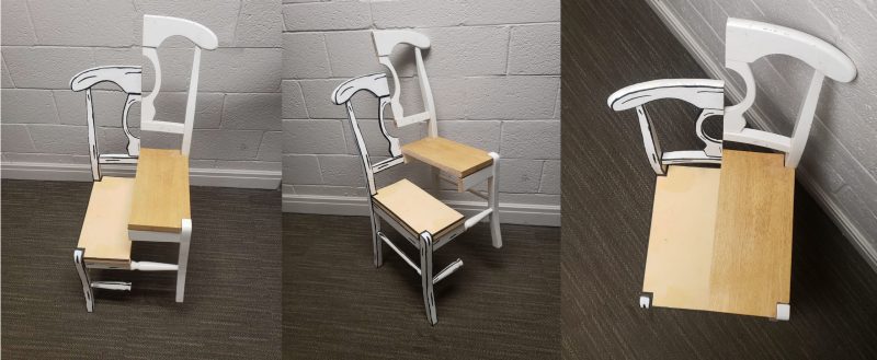
Nylah Desnoyer
"Coming up with a response to the prompt was tough. After days of brainstorming, I eventually settled on the idea of manipulating a chair because it is a common object that everyone would recognize. I then thought through the prompt in three phases continuously alternating the chair to fit that phase of the prompt. The first phase was meant to respond to the phrase “create and intervention.” This made me want to cut the chair in half to intervene with its primary function. I sawed the chair vertically so that the intervention would be very “in your face” and provocative. The second phase responded to “changes the use.” This led me to offset the re-assembly of the chair so that it looks as if it could serve as a multi-step step stool. The final phrase that I focused on was “alters the meaning.” I decided to paint flat, cartoon lines and colors to alter how the chair is perceived. So when the viewer looks at it, it looks like it should be flat and not exist in our three-dimensional world. When all three elements are put together it plays your mind and perception of a common, everyday object."
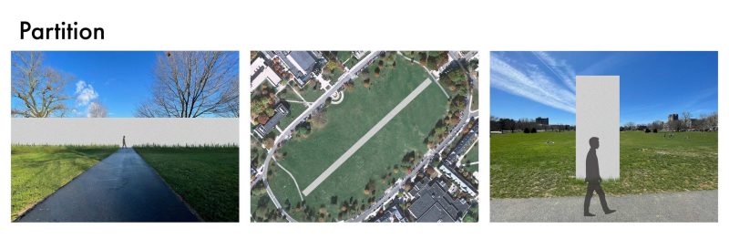
Gabrielle DeCotiis
"The prompt for this competition motivated me to explore how I could change the use of something that people interact with every day. I wanted to work with a location that would have meaning to everyone who studies and works at Virginia Tech and decided that I would alter the Drillfield. The Drillfield is a huge grassy area on campus that many students use to study, sunbathe, socialize, have dinner on nice nights, and so much more. However, it is also used to get from the residential side of campus to the academic side often by students. I wanted to create an intervention that would disrupt this traffic flow so I created a wall that spanned from the Pylons, at the East end of the campus, all the way to the opposite side of the Drillfield, only leaving two paths intact on each end and removing the rest. In theory, this would eliminate the Drillfield as a means of direct passage and force students to take a longer way to get from one side of campus to the other, necessitating that they allocate more time to get from place to place."
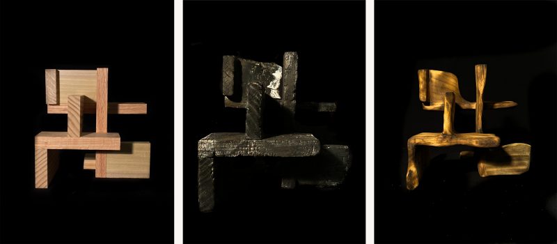
Noah Freedman
"My project is the intervention of fire on wood. I explored the transformation in shape caused by the application of fire and its inherent unpredictability. To add some variety to the burn, the structure was built using three types of wood: oak, pine, and poplar. The unpredictable natural intervention of fire turned what was straight-edged and solid to flowing and delicate. After being burned it retained its original shape but only with a flimsy shell of charcoal. This shell was scraped off to reveal the shape then sanded to reveal the wood to the world again."
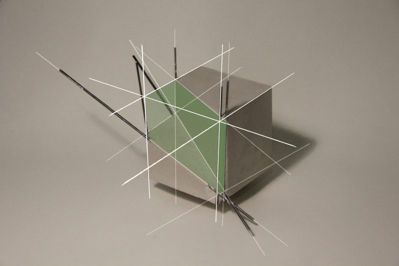
Malachi Mercado (honorable mention)
"This project is meant to present a triptych through layered images, exploring the meaning of how a solid form can be represented, and illustrating an existing but “non-existent” form. From the beginning, the shape of the model was not the primary focus, but rather, the analysis was meant to be a reproduction of what was removed. This removal is easy for someone to notice, but the protruding wireframe suggests an intervention towards understanding its materiality, considering the form as a whole. To further question the perception of a part as it relates to the whole, contrasting construction lines are overlaid to add a second layer to the image. The construction lines that complete the cube are highlighted to define the original form. As an expression of shadows and faces that exist as a part of the cube and of the shape taken from the model, the third layer is created. Solid shapes of varying opacity fill the positive space between construction lines as if the form were once again whole."
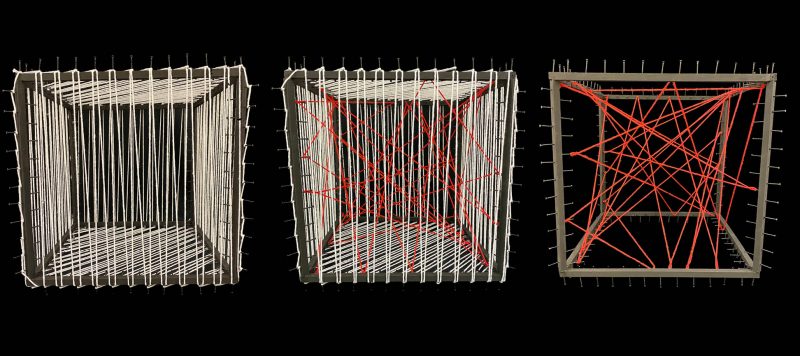
Kristin Rice (honorable mention)
"For this competition, I did not want to create a singular intervention but instead make two compositions that intervene with each other when put together. I have past experience with thread art, but this time I wanted to do something new and complex, so I chose to create the thread art in a three-dimensional space. For the outside, I wanted to create a simple recurring pattern so that it would still be easy to see the inside of the cube. For the inside, to contrast with the white thread, I created a haphazard design in red that is seemingly devoid of any pattern. Together they overlay to create a new composition with a fascinating array of shapes that changes depending on which direction you view the cube from."
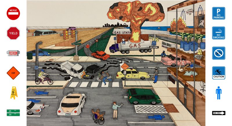
Sam Hunter (honorable mention)
"The primary goal in this intervention was to encapsulate the importance of recognizable symbols. The knowledge of symbols—in this case, signage—is often deeply subconscious. This subconscious interaction between person and symbol is predetermined by color, shape, materiality, and form; when one strips away one or two of these identifying factors, the sign becomes illegible, even if the word (or direction) is accurate and present. Intervening in the physical presence of symbols creates a psychological dilemma, thereby causing chaos and disorder. One instance of intervention would likely be corrected, so it was appropriate to create a world of intervention in order to guarantee a copious amount of destruction and confusion."
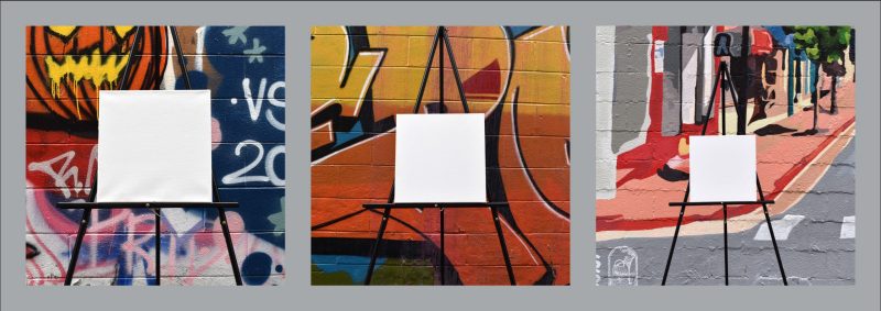
Grayson Bennett (honorable mention)
"For this project, I wanted to create a physical intervention in an already existing artistic landscape. A bit of Blacksburg is in the images; all the wall art was photographed downtown. The white canvas was chosen because it spoke to the process of designing and creating in general – you almost always start from a blank. I wanted to turn that idea on its head and instead of the canvas being something that art is put on to, it instead blocks the visual information of the wall art from the viewer through intervention. My hope is that the viewer places their own preconceptions onto and behind the canvas in order to further their understanding of the typical creative process, how that process can be ‘intervened’, and thus make them question their beliefs pertaining to design."